Interior design presentation boards: a practical guide
By Faura ·
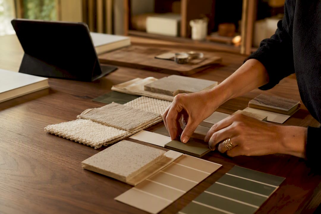
A professional interior design presentation board is a curated, client-facing document that turns concept into a decision. It combines strategy, meaning the brief and the criteria you’re being judged against, with the visual assets a client needs to say yes. Every section that follows in this guide exists to help you build one that gets signed off faster.
Before you open a design tool, pull together the raw material. A complete board typically needs:
- The project brief and success criteria
- A mood board establishing tone and direction
- A colour palette with named references or codes
- Material and finish samples
- Plans, elevations or renderings
- An FF&E (furniture, fixtures and equipment) schedule
- A lighting plan
- A timeline and budget summary
Get these seven or eight elements gathered first, and the rest of this guide will show you exactly how to arrange them.
Key Takeaways
An effective interior design presentation board pairs a clear strategic brief with sequenced visual evidence, and it wins faster approval when it limits client choice to no more than three named directions.
| Point | Details |
|---|---|
| Lead with the brief | Open every presentation by restating the brief and agreed success criteria before showing visuals. |
| Cap your directions | Present one option for a specific brief, or up to three for genuine exploration, never more. |
| Match tool to stage | Use freeform canvases like Milanote early, then linear decks like Figma Slides or Keynote for the final pitch. |
| Label everything | Name every swatch, image and colour reference so feedback stays specific and actionable. |
| Use a trade showroom for sourcing | Faura’s Westminster showroom gives designers curated samples and a hosted space to present boards to clients. |
Table of Contents
- What is an interior design presentation board?
- What types of presentation boards should you use?
- What should go on each page of a presentation board?
- How should you order a client presentation?
- Which tools should you use to build a presentation board?
- Should you present printed boards or digital boards?
- What layout and hierarchy make a board easy to read?
- What mistakes should you avoid on a presentation board?
- How can a trade showroom speed up sourcing and client hosting?
- How long does a presentation board take, and what should you charge?
- What is a step-by-step process for building a board?
- A designer’s note on keeping clients focused
- How Faura’s showroom supports your presentation process
- Frequently asked questions
- Sources
What is an interior design presentation board?
A presentation board is a formal, decision-oriented document. It exists to secure sign-off on a specific direction, at a specific project stage, with a specific budget attached. A mood board is something else entirely: an exploratory, inspirational tool designers use early on to test tone, texture and colour before anything is locked down.
Confusing the two causes real problems. Show a client a loose mood board when they expect a decision-ready proposal, and you’ll get vague feedback (“I like it, but…”) instead of a clear approval. Present a fully resolved board too early, before the brief has been agreed, and you risk building on the wrong foundation entirely.
| Aspect | Mood board | Presentation board |
|---|---|---|
| Purpose | Explore tone, texture, colour direction | Secure client decision and sign-off |
| Audience | Often internal, or early client check-in | Client, always |
| Content | Loose imagery, references, textures | Brief, palette, materials, plans, FF&E, budget |
| Project stage | Concept development | Concept presentation through to final approval |
| Format | Freeform, exploratory | Structured, sequenced, decision-focused |
In practice, most projects use both. The mood board is where you think; the presentation board is where the client decides. Cedreo’s breakdown of a complete board confirms this structure: mood boards, colour palettes, materials, 2D and 3D plans, renderings and a timeline with budget estimations, assembled specifically for client sign-off, not exploration.
What types of presentation boards should you use?
Different meetings call for different boards. Matching the format to the decision at hand is what separates a persuasive presentation from a confusing one.
- Concept or strategy board. Leads with the big idea. Use this first, before anything technical, to align on direction.
- Mood board. Establishes atmosphere and tone; often folded into the concept board rather than shown alone.
- Material board. Shows finishes, textures and samples side by side for comparison.
- FF&E board or schedule. Lists specific furniture, fixtures and equipment with codes and pricing.
- Plans and renderings board. Technical documentation, floor plans, elevations, 3D visuals.
For a first concept pitch, lead with the concept board and hold the technical documentation back. Clients need to buy into the idea before they’ll engage seriously with plans and specification. For a later-stage review, once a direction is approved, flip the order: lead with plans and FF&E, because the strategic conversation is already behind you.
A single, focused board works for small projects or narrow decisions, like choosing between two sofa options. A full renovation or multi-room project usually needs a sequence: concept board first, then material and FF&E boards room by room, then a final plans-and-budget board to close the meeting.
What should go on each page of a presentation board?
Every page earns its place by answering a specific question the client is asking, whether they say it aloud or not. Build the board page by page, and you avoid the two most common failures: overloading a single page with too much information, or leaving out the detail a client needs to feel confident.
The cover and brief. Open with a cover page carrying the project name, client name, date and your studio identity. Follow immediately with a one-page restatement of the brief and the criteria you agreed together. This isn’t decoration. Storyflow’s research on client presentations suggests that leading with the brief and its success criteria frames everything that follows as a solution to an agreed problem, which can reduce vague, subjective feedback later in the meeting.
Mood board and colour palette. Show four to eight curated images per direction, each labelled with its source or reference where relevant. The palette should carry named colours or paint codes, not just swatches. A client who later asks “which grey was that?” should be able to find the answer on the page itself.
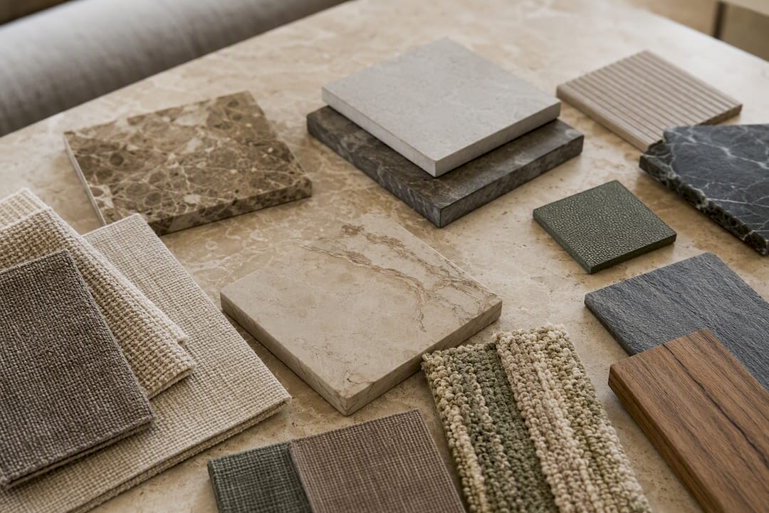
Materials and samples. Photograph every material against a consistent background and under consistent lighting so finishes read true against each other. If you’re presenting digitally, include a close-up and a “in context” shot for texture-heavy materials like stone or textured plaster. Consistency here matters more than most designers assume: uneven lighting between sample photos is one of the fastest ways to make a coherent scheme look mismatched on screen.
Plans, elevations and renderings. Export plans and elevations at print resolution, minimum 300 DPI, even for digital delivery, since clients often zoom in on screen. Renderings should sit at consistent angles and lighting across a project so rooms compare fairly.
FF&E schedule. This is where vagueness costs you money and time later. A proper FF&E line needs, at minimum:
| Field | Example |
|---|---|
| Item | Lounge sofa |
| Code | DCW.LC2.OAK |
| Finish | Oak frame, boucle upholstery |
| Dimensions | 210cm W |
| Lead time | a rough phase timeline |
| Cost | a single summary figure |
Budget and timeline. At concept stage, a single summary figure and a rough phase timeline is enough; clients aren’t ready for line-item detail before they’ve approved a direction. Once a concept is signed off, expand this into a full schedule with lead times against each FF&E item, because that’s the point where budget accuracy actually matters to the client.
Pro Tip: Label everything. A single unlabelled swatch or unnamed reference image invites the vaguest kind of feedback (“not sure about that one”). A labelled item invites a specific decision (“swap the oak for walnut”). The less copy you write, the more precisely you write it.
How should you order a client presentation?
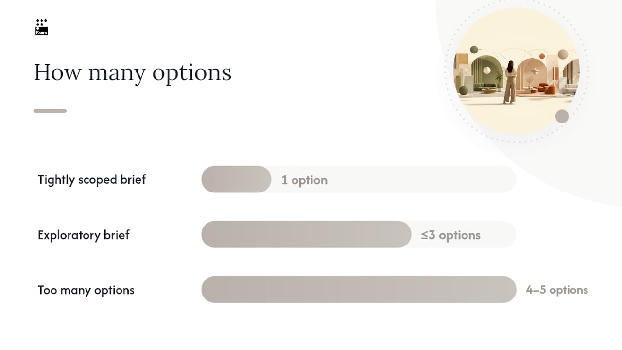
Present too many options and you invite indecision. Professional practice suggests one recommended direction when the brief is specific and tightly scoped, and no more than three genuinely distinct strategic directions when the project calls for real exploration. Beyond that, clients stall, because comparing four or five near-identical schemes is cognitively exhausting rather than clarifying.
The sequence matters as much as the count:
- Restate the brief and criteria. Open by reminding the client what problem you’re solving and how success will be judged.
- Name each direction. Give every concept a short strategic name, not just “Option A”. A name like “Warm Minimalist” or “Coastal Formal” gives the client language to discuss it.
- Attach the rationale. For each named direction, explain in one or two sentences why it answers the brief, before showing any imagery.
- Reveal the visuals. Mood board, palette, materials, in that order, for each direction.
- Ask a clear decision question. Close with something specific: “Which of these two directions should we develop further?” rather than “What do you think?”
Storyflow’s guidance on presenting design concepts backs this structure directly: naming each direction and attaching rationale before the visuals means the client compares work to work, not a screen to memory.
Pro Tip: Before the meeting, check your directions against each other honestly. If two concepts share the same palette, the same furniture silhouettes and the same spatial logic, they aren’t two options. They’re one option shown twice, and a sharp client will notice before you finish presenting.
Handle feedback in the room by writing it down against the specific named direction it applies to, not as a general note. It keeps the follow-up email precise and stops small preferences from quietly becoming scope creep.
Which tools should you use to build a presentation board?
Tool choice depends entirely on project stage, not personal preference. Using the wrong tool at the wrong stage is one of the quiet reasons boards take longer to build than they should.
Early concepting calls for a freeform canvas: Milanote or Storyflow, where a brief, research and rough concepts can sit side by side before anything is locked down. Milanote has long served this stage well, offering a calm, mixed-media workspace for collecting inspiration quickly.
Collaborative moodboarding works best on Miro or Adobe Firefly Boards, particularly when a team or a client is contributing references in real time. Miro’s moodboard tool keeps the board connected to underlying research and includes a Presentation Mode, so the working canvas becomes the client walkthrough without rebuilding anything in slide software. Adobe’s Firefly Boards adds generative options that speed up early iteration when you’re testing directions quickly.
Ordered client decks belong in linear presentation software: Figma Slides, Keynote, PowerPoint or Pitch. Morpholio Board remains a popular mobile-first option for designers sketching and pinning materials on site. Adobe InDesign and Adobe Photoshop still do the heaviest lifting for print-ready layout and image finishing, particularly for boards heading to a printer rather than a screen. Canva fills a useful middle ground for studios without dedicated design software, offering ready-made templates that speed up layout.
Specification-driven studios should look at tools that bridge design and procurement directly. Programa’s presentation feature pins live product data, codes and pricing to images and plans, which prevents the classic gap between a beautiful concept board and a chaotic procurement spreadsheet built weeks later.
| Format | Best for | Example tools |
|---|---|---|
| Freeform canvas | Early research and concepting | Milanote, Storyflow |
| Collaborative moodboard | Team or client input in real time | Miro, Adobe Firefly Boards |
| Linear deck | Formal client presentation | Figma Slides, Keynote, PowerPoint, Pitch, Canva |
| Specification-linked | Studios bridging concept to procurement | Programa |
For export, keep images at 300 DPI minimum for anything printed, export PDFs with bleed included if a printer is finishing the board, and embed a CMYK colour profile for print, RGB for screen. When sharing digitally, set view-only access as default and enable comments rather than full editing rights, so client feedback stays contained and attributable to a specific slide or image.
Should you present printed boards or digital boards?
Printed boards still win for material and texture decisions. A client can feel the weight of a fabric, see how a stone catches natural light, and compare finishes side by side in a way no screen fully replicates. Digital boards win for speed, revision and remote collaboration, and they’re far easier to update after a meeting.
- Printed boards work best for material-heavy decisions, final sign-off meetings, and any client who’s told you they prefer to see things “in the flesh”.
- Digital boards work best for early concepting, remote clients, and any project where you expect several rounds of revision.
- Physical samples should be photographed against a consistent, neutral background so they can be dropped into a digital board without colour distortion.
- Pre-meeting packs should carry only the brief and mood direction, never the full reveal. Save the material and FF&E detail for the room, where you control lighting and pacing.
Pro Tip: Transport samples in a labelled, dedicated case rather than loose in a bag. A scuffed or dusty sample photographs badly and looks unprofessional in person, and lighting a viewing room with warm, even light before the client arrives makes every material read better than it will under office strip lighting.
What layout and hierarchy make a board easy to read?
A board that clients can read in seconds, rather than minutes, wins more approvals. Most boards fail on hierarchy, not content: too much competing for attention, nothing clearly leading the eye.
- Use a consistent grid, typically a three or four column structure, with equal margins across every page so the board feels considered rather than improvised.
- Give the hero image, usually the key rendering or the primary mood reference, at least twice the visual weight of any supporting image on the same page.
- Keep labels in a smaller, consistent type size throughout, so annotation never competes with the visual for attention.
- Leave generous white space around materials and swatches. Crowding samples together makes it harder, not easier, to judge them individually.
- Include a scale reference, a person silhouette in a rendering, a ruler beside a material sample, so clients can judge proportion without asking.
What mistakes should you avoid on a presentation board?
Most weak boards fail for the same handful of reasons, and each one has a quick fix.
- Opening with visuals instead of the brief. Fix it by starting every meeting with a one-page recap of what you agreed to solve.
- Presenting near-identical options. Fix it by checking your directions against each other honestly before the meeting; if the palette and furniture silhouettes match, it’s one option, not two.
- Overloading pages with unlabelled references. Fix it by naming every image and every swatch; unlabelled content invites vague feedback.
- Offering too many directions. Fix it by capping concepts at three, and defaulting to one when the brief is already specific.
Pro Tip: If you find yourself explaining a board verbally more than the board explains itself visually, the layout has failed, not the client’s understanding.
How can a trade showroom speed up sourcing and client hosting?
A trade showroom solves a problem most presentation boards can’t: getting real materials into the client’s hands quickly. Faura, a trade-only showroom and residency in Westminster, London, gives designers access to a curated library spanning over 200 brands, which shortens the gap between choosing a material for a board and actually holding a sample of it.
Booking a showroom appointment to build a physical board typically follows a simple sequence: confirm the palette and material direction from your digital board first, then book time at the showroom to pull physical samples against that shortlist, photograph them under consistent light for use back on the digital board, and reserve the same space to host the client for the actual review.
- Curated product library removes hours of individual supplier sourcing
- Trade terms are confirmed directly with each approved trade account
- A hosted showroom space means the client review happens somewhere considered, not a studio desk or a site cabin
Pro Tip: Book the showroom slot before you finalise the material shortlist. Seeing a physical sample sometimes changes the decision entirely, and it’s far better to discover that before the board is finished than during the client meeting.
How long does a presentation board take, and what should you charge?
A single-room concept board, brief through to a finished digital deck, typically takes a designer somewhere between four and eight hours, depending on how many material options are being tested. A full-house presentation, spanning multiple rooms with FF&E schedules and renderings, runs considerably longer, often across several days once revisions are factored in.
Pricing for mood and concept boards varies by studio and scope. Many designers scope a standalone mood board as a fixed fee, reserving hourly billing for full concept development where the number of revisions is harder to predict upfront.
| Deliverable | Typical time | Pricing approach |
|---|---|---|
| Single mood board | 2 to 4 hours | Fixed fee |
| One-room concept board | 4 to 8 hours | Fixed fee or hourly |
| Full-house presentation | Several days | Hourly, or fixed fee per room |
What is a step-by-step process for building a board?
A repeatable process saves more time across a career than any single template. Follow the same sequence project to project, and building a board stops being a fresh creative problem every time.
- Confirm the brief and success criteria with the client before opening any design software.
- Gather references and build the exploratory mood board on a freeform canvas.
- Narrow to one to three named strategic directions.
- Select materials and photograph or source samples consistently.
- Build plans, elevations and renderings for each direction.
- Draft the FF&E schedule with codes, dimensions and lead times.
- Assemble the final deck in your presentation tool of choice, ordered per the structure above.
- Export at print and screen resolution, and save the master file in a shared project folder for reuse.
Assign ownership clearly: one team member usually owns sourcing and the FF&E schedule, another owns the visual layout, so nothing gets duplicated or missed.
A designer’s note on keeping clients focused
The first ninety seconds of a client meeting decide more than most designers realise. Open with the brief, not the work. Say plainly what problem you were solving and how you’ll know if you’ve solved it. Clients who hear that framing give feedback about fit, not taste, for the rest of the meeting.
Channel every piece of feedback back to the brief you opened with. “I don’t love the blue” becomes useful once you ask whether it undermines a criterion you agreed on, or is simply a preference to note for later. Most feedback sorts cleanly into one of those two buckets once you ask.
For in-person viewings, carry a compact kit: labelled material swatches, a portable light source for consistent viewing, and a printed one-pager of the brief as backup if a screen fails.
How Faura’s showroom supports your presentation process
Sourcing eats time that should go into the presentation itself. Faura’s trade membership gives designers access to a library of over 200 brands, with samples, technical files and procurement handled by one team, which means the material shortlist for your next board doesn’t require chasing a dozen separate suppliers.
The showroom itself, in Westminster, doubles as a hosting space. Bring a client in to view real materials against your digital board, in a room built for exactly that conversation, rather than trying to recreate texture and scale on a laptop screen. Designers who want to see how trade accounts and showroom access work in practice can book time at Faura to review terms and check appointment availability.
Frequently asked questions
What’s the difference between a mood board and a presentation board?
A mood board explores tone and direction early in a project. A presentation board is the formal, client-facing document used to secure a decision, and it includes the brief, palette, materials, plans and budget together.
How many design concepts should I present to a client?
One, if the brief is specific and tightly scoped. Up to three genuinely distinct strategic directions if the project calls for exploration. More than three tends to stall decisions rather than clarify them.
What software do most interior designers use for presentation boards?
It depends on the stage. Milanote and Storyflow suit early concepting, Miro and Adobe Firefly Boards suit collaborative moodboarding, and Figma Slides, Keynote, PowerPoint, Canva or Adobe InDesign suit the final client deck. Morpholio Board remains popular for on-site sketching.
Should I print my presentation board or present it digitally?
Print for material-heavy decisions and final sign-off meetings, where texture and finish matter. Present digitally for early concepting, remote clients and any project expecting several revision rounds.
How much should I charge for a mood board or concept board?
Many studios charge a fixed fee for a standalone mood board, given two to four hours of typical work, and either a fixed fee or hourly rate for a full concept board depending on how many revisions the scope allows for.
Sources
For deeper how-to material on presenting concepts persuasively, Storyflow’s guide covers structuring client meetings in detail. Designers exploring collaborative canvases should try Miro’s moodboard feature directly, while studios building portfolio sites to host clickable presentations may find Medway Web Design’s guide to interactive portfolios a useful starting point.
- How to Make Interior Design Presentation Boards | Cedreo
- How to present design concepts to clients (2026 guide) | Storyflow
- Interior Design Presentation Software | Programa
- Miro moodboard creator