Quick Wins for Showroom Merchandising: Make a Spec Studio for Designers
By Faura ·
Quick Wins for Showroom Merchandising: Make a Spec Studio for Designers
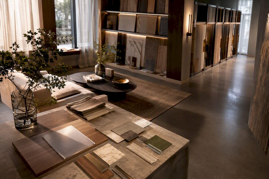
The most effective merchandising approach for a trade showroom pairs anchor vignettes with distinct demonstration, comparison and consultation zones, backed by a well-organised material library. A Westminster showroom applies exactly this model for independent designers and architects. The ideas below are practical enough to act on this week.
TL;DR:
- A three-zone layout with demonstration, comparison, and consultation areas improves clarity and speeds decision-making by reducing cognitive load.
- Lighting with a CRI of 90 or above and layered tiers ensures accurate colour rendering, increasing client trust and purchase likelihood.
- Regularly rotating hero vignettes and thematic displays maintain client engagement and reinforce the showroom’s relevance.
- An accessible, well-organized material library with clear labelling and dedicated workbenches supports efficient specifier workflows.
- Structured appointment scheduling and trained staff with technical knowledge enhance the client experience and minimize decision fatigue.
Table of Contents
- What are the best showroom merchandising ideas for trade showrooms?
- How do you put these showroom layout tips into practice?
- Keeping a trade-ready material library
- Lighting and technical specs that make finishes readable
- How do you measure whether your showroom merchandising is working?
- Faura in practice: applying the showroom merchandising ideas
- Optimising appointment scheduling to improve client experience
- Training showroom staff to guide specification decisions
- Customising displays for different client segments
- Rotating showroom displays to stay fresh and relevant
- A showroom director’s note on overstyling
- How Faura supports your showroom merchandising
- Sources
- FAQ
What are the best showroom merchandising ideas for trade showrooms?
A trade showroom succeeds when it behaves like a specification studio, not a retail floor. These eight ideas cover the ground that matters most.
- Anchor vignettes with real depth. Hero moments need believable scale to persuade. A recommended vignette depth of 18 to 24 inches gives a room enough presence without eating the floor plan, and the piece does not need to be the most expensive item on show to be the most convincing.
- Three-zone structure. Split the floor into demonstration (where products get used), comparison (where finishes sit side by side) and consultation (where a designer sits down with a client). Design frameworks built around separate demonstration, comparison and consultation zones cut cognitive load and make differences readable at a glance.
- Contextual storytelling. Organise displays around problems and applications rather than product categories, so a client sees how a finish behaves in a bathroom setting rather than reading a spec sheet. Showrooms organised around applications educate specifiers faster than catalogues alone.
- Adjacency and spatial bundling. Placing a statement sofa near a complementary rug and lighting piece shifts the client’s thinking from a single purchase to a composition, which raises average order value without discounting.
- Interactive, demonstrable features. Let drawers open, switches flick, and fabrics get handled. Demonstration consistently beats static display for conversion.
- Minimalist wayfinding. Fewer visible choices per sightline reduce decision fatigue and keep attention on the pieces that matter.
- Technical workbenches with high-CRI lighting. Trade showrooms increasingly function as specification hubs with dedicated workbanks, where designers coordinate textures under controlled light.
- Accessible material library. Samples that are visible but locked away frustrate specifiers. Tactile access to finishes speeds decisions considerably.
How do you put these showroom layout tips into practice?
Turning a shortlist into a working floor plan comes down to sequencing. Start with the changes that cost the least and prove the concept before committing to a full refit.
Quick wins (this week):
- Upgrade accent lighting on your one or two hero vignettes.
- Carve out a dedicated consultation corner with seating and a surface for laying out samples.
- Introduce stash bins near reception so incoming samples never pile up on a display table.
Layout sequencing (next refit):
- Map sightlines from the entrance before placing a single piece.
- Build a circulation loop rather than a dead-end aisle, so the path itself gives a reason to keep walking.
- Set pause points roughly every 4 to 6 metres, matching the stopping-point intervals shown to raise perceived coherence.
Sample workflow:
- Reception intake, then temporary stash, then cataloguing, then a clear return or take-away point.
Fit-out checklist: confirm workbench power access, set surface heights for standing consultations, and keep storage within arm’s reach of the workbench rather than across the room.
Digital aids: a QR code linking a vignette to its BIM file, sample labelling with matching QR tags, and a one-tap quote request form at the consultation desk all remove friction at the moment a client is ready to commit.
Pro Tip: Test your circulation loop by walking it yourself with a tray of samples. If you have to backtrack or turn sideways anywhere, so will your client.
Keeping a trade-ready material library
A showroom with an unmanaged sample wall becomes a storage room during a busy project phase, and that undermines every other merchandising decision on the floor. Operational durability, not just display design, is what keeps a library usable under pressure.
- Stash bins for incoming samples. Every new arrival gets a temporary home within minutes of arriving, not a spot on the display table.
- Durable, consistent labelling. A cataloguing standard that a locum member of staff can follow speeds retrieval and stops finishes going missing mid-project.
- Wait-height display surfaces. Sample trays sit at a height a designer can browse standing, without crouching or lifting.
- Scheduled maintenance. Assign a named person to reset the library weekly, with extra passes during peak project phases.
- A clear take-away policy. Decide in advance which samples clients can remove, which need reservation, and how returns get tracked.
Lighting and technical specs that make finishes readable
Lighting decides whether a client trusts what they see. Trade showrooms are shifting towards workbenches lit with high-CRI sources so colour and texture read accurately rather than under generic retail lighting.
- Use lamps rated 90 CRI or above wherever finishes are being compared or specified.
- Layer lighting in three tiers: ambient for orientation, accent for hero vignettes, and dedicated workbench lighting for close inspection.
- Match colour temperature to the vignette’s real-world context; warmer tones for residential lounges, cooler and more neutral for kitchen and bathroom finishes.
- Verify accuracy with a simple white card test under the workbench light, or by comparing two known swatches side by side.
- Fit workbenches with connectivity for BIM files and large-format renders, so a lighting decision can be checked against the actual project file on the spot.
A high proportion of final purchase decisions happen in the exhibition space itself, and tactile engagement under accurate lighting increases commitment to buy.
How do you measure whether your showroom merchandising is working?
Three or four numbers tell you most of what matters. Attachment rate, the share of visits that end with an adjacent product added to the main specification, shows whether your bundling is actually working. Zone dwell time, sample-take rates and photography frequency act as proxies for genuine attention rather than idle footfall.
- Track attachment rate against each hero vignette monthly.
- Run small A/B tests: move one hero piece, swap one lighting temperature, and compare dwell time before and after.
- Collect informal designer feedback after appointments and run occasional secret-shopper walkthroughs.
- Feed findings into a two-week refresh cycle rather than waiting for a full seasonal reset.
Faura in practice: applying the showroom merchandising ideas
A residency and trade showroom in Westminster puts these principles to work daily. This operation minimises the time designers spend sourcing by treating them as clients, offering exclusive procurement and operational support rather than a simple product listing. The showroom hosts designers, brands and private clients under one roof, representing many curated brands and serving clients internationally through its curated showroom network. For a reader building their own version, the lesson is structural: pair a curated library with genuine procurement support, and specification friction drops sharply.
Optimising appointment scheduling to improve client experience
A showroom that runs on ad hoc walk-ins loses control of its own pacing, and pacing is what protects the consultation zone from feeling rushed. Structured appointment slots, ideally 60 to 90 minutes for a first consultation and shorter for follow-up specification checks, give staff enough time to walk a client through the demonstration and comparison zones without competing for attention with another visitor.
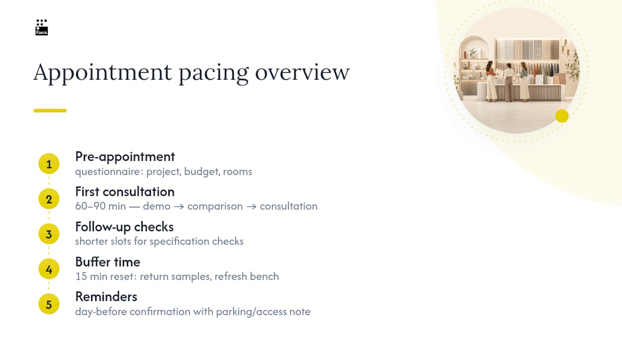
Booking systems matter less than the discipline behind them. A shared calendar visible to every showroom host prevents double-booking a consultation corner, and a short pre-appointment questionnaire, asking about project type, budget band and rooms in scope, lets staff pull relevant samples into the stash bin before the client arrives. That single step turns a generic browse into a tailored walkthrough.
Buffer time between appointments matters more than most showrooms allow for. Fifteen minutes to reset a consultation table, return borrowed samples to the library and refresh the workbench keeps the next client from inheriting the mess of the last. Confirmation and reminder messages sent a day ahead, with a note on parking or building access, cut no-shows without adding pressure. For a trade showroom hosting architects and brands as well as designers, a slightly longer slot on brand launch days accounts for the extra time needed to walk a group through a new collection.
Training showroom staff to guide specification decisions
The strongest merchandising layout fails if the person walking a client through it cannot answer a technical question on the spot. Staff need working knowledge of material performance, not just product names, so a conversation about a veneer’s durability or a fabric’s cleaning code does not stall the appointment.
Structured shadowing works better than a manual handout. New staff should sit through several live consultations before running one, watching how an experienced host reads a client’s pace and adjusts which zone to visit first. A quiet client who wants to browse the comparison zone unassisted needs a different approach from one who arrives ready to commit and heads straight for the consultation corner.
Regular product briefings from represented brands keep staff current, particularly when a new collection arrives or a finish gets discontinued. A short weekly briefing, ten minutes, covering what changed in the material library that week, prevents a host recommending a sample that is no longer in stock. Role-playing objection handling, price sensitivity, lead-time concerns, colour matching doubts, builds confidence faster than reading a script. The goal is a host who can move a client from browsing to a firm next step without ever sounding like they are selling.
Customising displays for different client segments
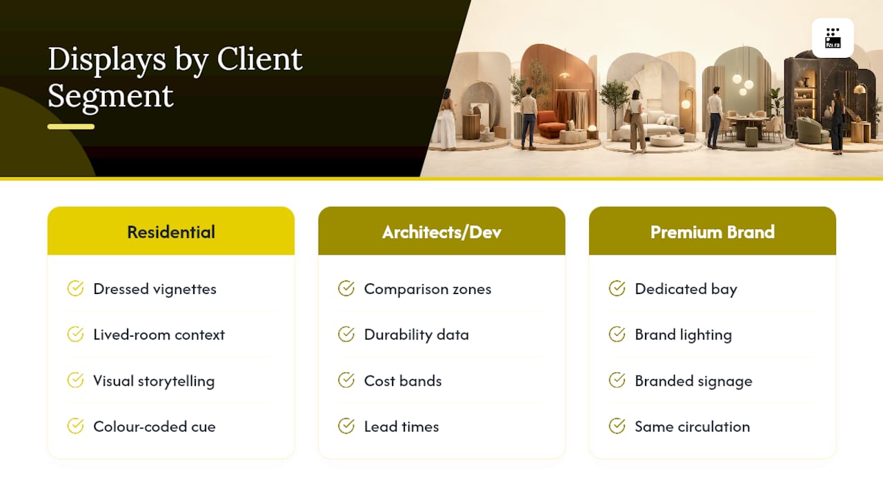
A residential designer sourcing for a single family home has different needs from an architect specifying finishes across a 40-unit development, and a showroom that treats both the same way wastes the advantage of a curated library. Segmenting displays by client type sharpens relevance without duplicating floor space.
For independent designers working on residential projects, lean into fully dressed vignettes that show a finish in a lived context, bedroom, bathroom, living space, so a client can picture the outcome rather than reading a spec sheet. For architects and developers specifying at scale, comparison zones matter more than storytelling: durability data, cost bands and lead times displayed alongside the physical sample speed up multi-unit decisions considerably.
Premium brands hosted within the showroom benefit from a different treatment again. A dedicated bay with brand-specific lighting and signage, distinct from the general comparison wall, protects brand identity while keeping the piece within the same circulation loop as everything else. This approach of representing brands within a shared but distinctly zoned showroom reflects this balance.
Segment cues can be as simple as a colour-coded appointment note that tells the host, before the client arrives, which zones to prioritise. It costs nothing to implement and prevents a residential-focused walkthrough being wasted on a developer who came for cost and lead-time data.
Rotating showroom displays to stay fresh and relevant
A showroom that never changes trains regular visitors to stop looking closely, and that is the fastest way to lose the attention a well-designed vignette is meant to earn. Rotating hero pieces on a seasonal or thematic basis keeps returning designers curious about what has changed since their last visit.
A quarterly rotation of one or two anchor vignettes, timed loosely around seasonal collections or a represented brand’s launch calendar, gives enough change to notice without disrupting the layout logic clients have already learned to navigate. Keep the underlying zone structure, demonstration, comparison, consultation, fixed even as the pieces within each zone change, so returning clients never have to relearn the floor.
Thematic rotations work well tied to real project trends: a focus on sustainable finishes one quarter, statement lighting the next. This gives staff a natural talking point for every consultation and gives brands within the showroom a reason to refresh their own bay. The two-week micro-refresh cycle mentioned earlier in measurement pairs well with a slower quarterly rotation: small tweaks keep data fresh, while the bigger seasonal change keeps the whole space feeling current.
A showroom director’s note on overstyling
Products people can touch get chosen. Products behind glass get admired and forgotten. The real risk is not too little styling but too much of it. Cram every surface with samples and clients freeze. Treat the room as a decision tool, not a gallery.
— Eugene
How Faura supports your showroom merchandising
The ideas above work best with a curated library and procurement relationships already in place, and that is precisely what building a trade showroom from scratch takes years to assemble. It offers independent designers, architects and premium brands a working base with that groundwork already done: a trade showroom, a library of many curated brands, and procurement terms negotiated on the designer’s behalf rather than left for each project to renegotiate. It suits practices that want appointment-ready vignettes and comparison zones without building and maintaining them in-house.
If the shortlist above has you rethinking your own floor, the practical next step is to see the model in person. Book a visit through the trade showroom or explore trade membership details to check what procurement support and showroom access would mean for your practice.
Sources
- Showroom design that sells: complete guide
- Top 5 showroom display strategies transforming the UK interior design sector in 2026
- How to turn your showroom into a B2B sales platform
- Furniture showroom psychology: B2B sales design guide
FAQ
What is the ideal depth for a hero vignette?
A recommended vignette depth of 18 to 24 inches gives enough scale to feel believable while keeping floor space efficient.
How many zones should a trade showroom have?
Three: a demonstration zone for hands-on use, a comparison zone for finishes side by side, and a consultation zone for one-to-one client discussion.
What CRI rating should showroom lighting use?
Aim for 90 CRI or above on any lighting used for comparing finishes, since accurate colour rendering is what lets a designer trust what they see.
How often should a showroom rotate its displays?
A quarterly rotation of one or two anchor vignettes keeps the space feeling current, paired with smaller two-week micro-refreshes based on performance data.
How does Faura apply these merchandising principles?
Faura’s Westminster showroom combines a curated library with dedicated procurement support, giving designers a working base that applies zoning, demonstration and material-library principles without the setup cost.